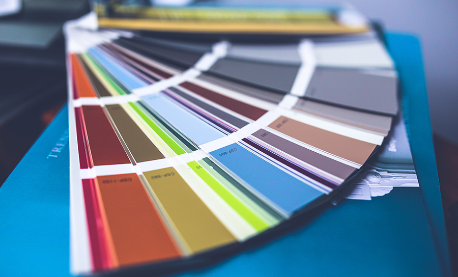
Neutral colors have many advantages as a paint color choice on your palette. The traditional definition of a neutral was a color which didn’t fall into any of the standard color families typically associated with the color wheel. These included the gray, brown, and white families. These subtle “no-color” colors could also easily support bright, deep, or subtle accents, making them virtually foolproof.
You’ll find yourself surrounded with neutrals in 2017, with several neutral choices selected as Color of the Year as well as darker choices that pair well with the neutrals. These colors are livable, flexible and classic. They are as ideal for individuals who are unsure about color choice and those who prefer colorful décor pieces or want to visually balance a strong accent wall.
Sherwin-Williams’ 2017 Color of the Year is Poised Taupe (SW 6039). The company expects the brownish-gray hue to become the year’s go-to color for home interiors. For a perfect pairing, Sherwin-Williams designers recommend combining Poised Taupe with pastels, brights, and jewel tones. Using the ColorSnap® Visualizer, you can explore the Color of the Year and with the swipe of a finger see it on any wall.
Benjamin Moore’s 2017 Color of the Year, Shadow 2117-30, is allusive and enigmatic — a master of ambiance. Benjamin Moore’s full trend palette pairs the Shadow with several others that range from pale and muted to saturated and deep. You could use Shadow over a mantel with a neutral color on the rest of the walls. Or it would be gorgeous as a trim.
Each year BEHR presents 20 new limited edition trend colors. Behr shares their 2017 color trends palette, and the predictions are a mix of bright and bold and surprisingly soft shades. Presented in three themes — Comfortable, Composed and Confident. Each is designed to be inspirational and personal, tailored to help you create a home that fits your style and personality. Explore the suggested schemes or create your own personal palette in the ColorSmart app.
The color experts at Valspar have curated a collection of 12 essential colors. The 2017 Valspar Colors of the Year are fresh yet familiar and inspired by a range of lifestyle influences from culture, fashion, design, nature and technology. The dozen ‘it’ hues reflect key prevailing trends: sustainable and simplistic living, spirituality and self-improvement.
Glidden is keeping it calm and cool for 2017 with Byzantine Blue—a serene gray violet blue. Paired with dark neutrals, it feels more gray, and with whites, more blue-purple.
A soft violet, Cloudberry is the 2017 pick from Olympic. The hue is meant to create a space for solace from the bustle of the day to day grind. You can explore their online visualizer tool, which you can use to virtually paint your room.
Neutral colors such as taupes, off-whites and light grays lack definitive color and therefore have little-to-no risk of creating discord with your current furnishings or color schemes. Choosing the right paint palette will create a cozy lifestyle and bring a sense of sanctuary into your Signature home.
Looking for a spark of inspiration on how you can incorporate a subtle and stylish neutral color palette into your home? Peruse this home design photo gallery, and explore these few ways to add a touch of taupe in your décor.
After you pick your palette, follow these foolproof tricks and tips that will make your project a breeze:
– Slide a rubber band over the open can to prevent messy spills and drips.
– A plastic bag, tightly secured with a rubber band, will keep a brush moist for a day or two in between painting sessions.
– When using latex paint, if you need to take a break for the night, place your brush in a plastic bag and place in your freezer.
– Dab some baby oil on splatters to remove latex paint from skin.
– Save small amounts of leftover paint in a baby food jar for quick touch-ups.
– Recycle your leftover paint by dropping it off to a PaintCare drop off site near you.
– The general rule is one gallon for every 350 square feet of area you want to paint. Measure your space roughly, then go to a paint professional in store or use an online paint calculator. Whatever the number, buy an extra quart for touch-ups. A new batch mixed later might not match.
– If you’re still not sure about the colors you are admiring and considering, experiment in a smaller space like a powder room, a small hall, or an accent wall. If you’re doing your own painting, pick an area that’s easy to do so you can see your results quickly.
Craving more tips and decor ideas? Visit our Paint Tips and Design Inspiration Pinterest Boards. We also have several other boards that includes everything from DIY home decorating projects to artful ideas for every room of your new home.
Be sure to follow Signature Homes on Facebook, Twitter, Pinterest, and Instagram as we share news and updates about our exciting new home communities as well as helpful homeowner tips.


Happy Holidays to you too Caterina!